Dangerzone - App for opening suspicious documents safely
Dangerzone - App for opening suspicious documents safely
The Dangerzone (DZ) team (part of the Freedom of the Press Foundation) approached Superbloom Design (partnered with OkThanks) via the Open Technology fund’s UXD to work on improving the UI and UX of both the native application as well as the promotional/informational website.
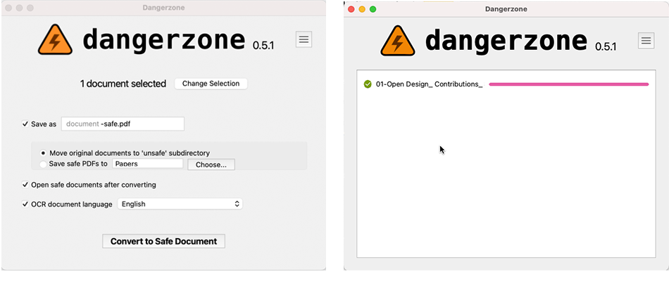
Above:Old design
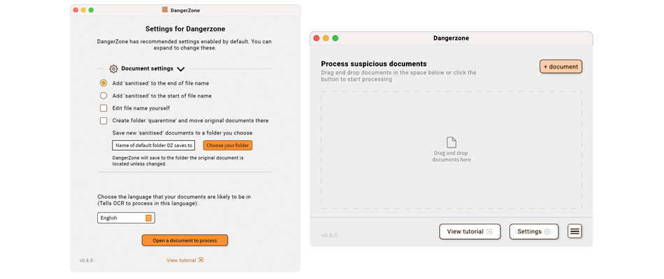
Above:New design with recommended expandable settings and drag and drop UI for files
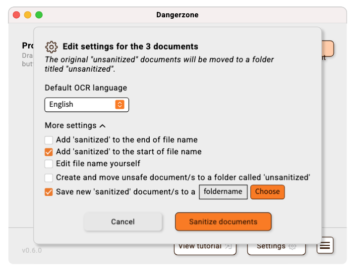
Above:New design with clearer document options choices
These examples illustrate a simple UX/UI intervention made as part of a wider feature process UX - the original Dangerzone offered a lot of settings upfront in a mixture of choice modes (checkbox, radio, file path picker etc.) but these were often already defaulted to what Dangerzone considers optional but by showing these to users, they believed this to be a vital choice in the step to complete a ‘make a document safe’ process. Many users didn’t know how to answer these complex choices and the most stressed user cases want to get a ‘cleaned’ document asap as it might contain vital news information or mission information. While re-designing we decided to let users know before selecting a document that there are recommended settings they can change at any time but they are defaulted to the recommended selections. We placed these choices behind an ‘expandable’ ui element so that the only essential choice, the document language selection, which OCR needs in order to ‘scan’ the language letter forms correctly as the only choice there and defaulted to English.
Team and collaboration
Myself and one other senior designer from Superbloom Design leading the UI/UX of the application feature development as well as the visual identity of the promotional/informational website. OkThanks led on the UX/IA of the promotional website and Dangerzone’s positionality.
The Dangerzone tech team of 5 was there to support throughout the process with better understanding of the feature needs, use cases and technical constraints.
Processes and methodologies
For this project, the majority of the user research had been completed to the clients satisfaction prior to our work. Our first responsibility though, was to properly digest, critique and apply that research to the problems, feature opportunities and user needs that were clear from our own use and assessment of Dangerzone. Grounding this previous research in our own heuristic analysis process allowed for clear understanding of where the user research backed certain user needs and ideas and where designer expertise needed to present a compelling usability fix or aspiration.
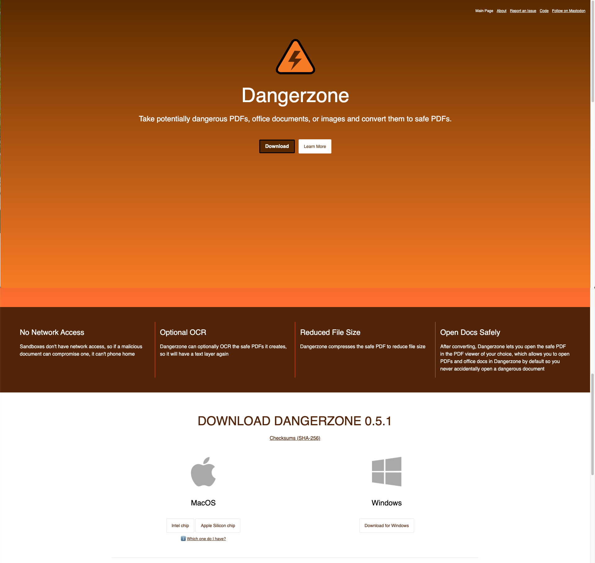
Above:Original Website design
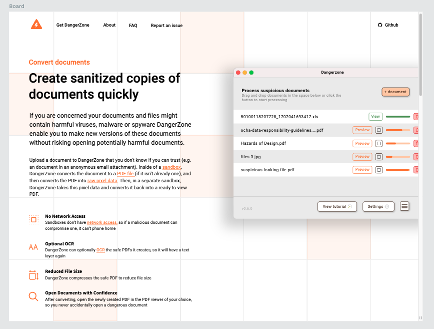
Above:Early website redesign idea
For the UI and UX design process myself and another team member approached a ‘native’ OS visual at first before moving into a more refined and professional use of the core colour palette and styles. We developed alongside the UX feature design screens a design UI library and built out a flexible design system in penpot.app using components, variables, flex box and the in-built libraries. We worked mostly in high fidelity since many of the features we were building UX/UI for were already described as user stories/user needs and ready to go into the development pipeline. Also, many of the choices users make in a tool the perform a complex security process are harder to express minute balance with low fidelity wireframes. I did use plenty of sketches in my early feature design phases and especially when in discussion about technological limitations and aspirations of features and/or the tool more widely.
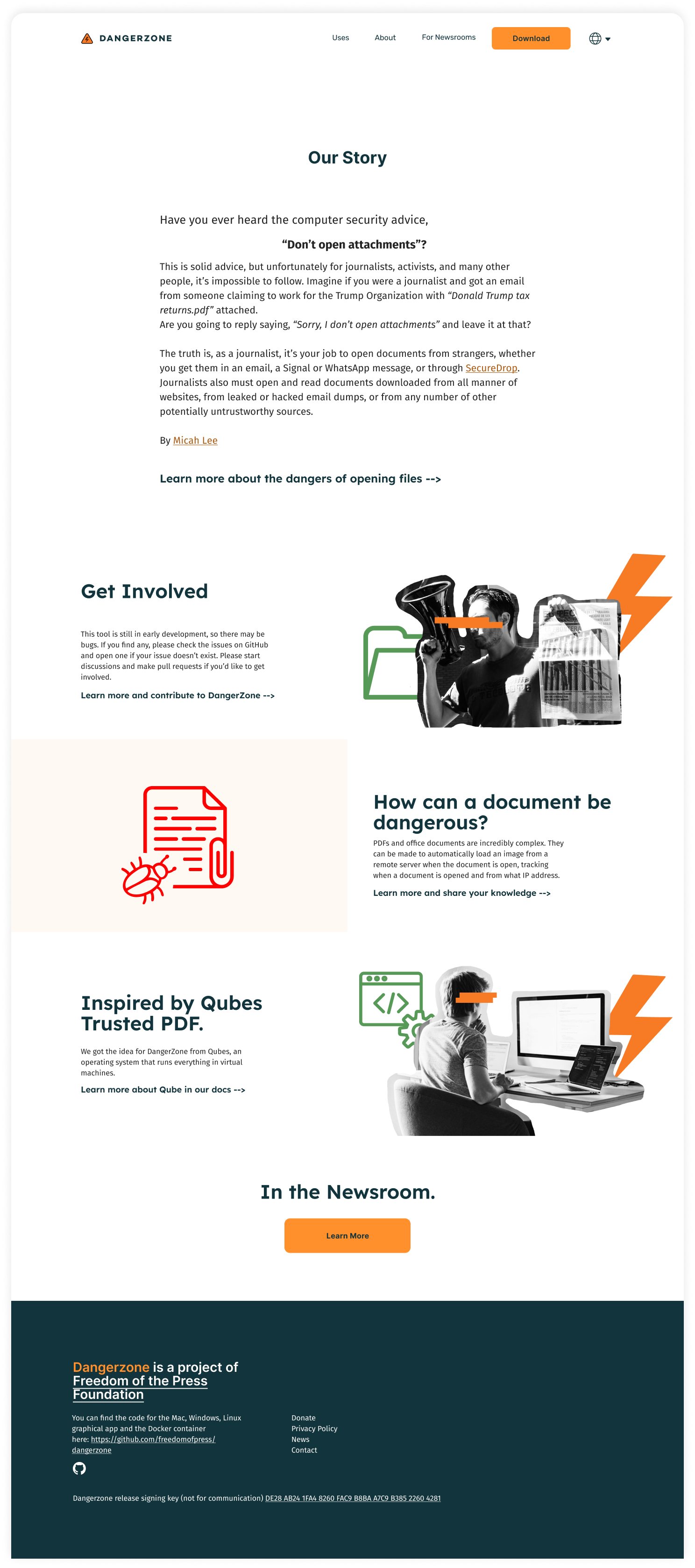
Above:Progress to the delivered website redesign
In this project we embodied the RITE methodology ‘Once you find a problem, solve it as soon as you can, and make the decision makers part of the research/development team.’
By using this methodology we were able to ‘red team’ our design treatments early and often with the technical implementation team and those in the team that had direct experience with core user personas.
For the communications and user adoption website we used a similar method but tested with people and researchers that were not deeply ingrained din the use of the application already. Since the website was intended to be the onboarding, adoption and further learning/support service journey for users we spent plenty of time unpicking and understanding what the core mental models and user needs were when exploring this application for workflow adoption. Not every journalist or human rights activist is instinctually going to find tools like this and they may have been directed by an organisation security team or a partner organisation to improve security and safety workflows or they may have been recommended the tool by a peer. Either way the learning curve for understanding what Dangerzone did and how it did it is steep and we wanted to refocus from the technical processes (OCR scanning making a ‘copy’ of the original ‘unsafe’ document) and move towards how this tool can improve safety regardless of how it does it - yet still slow information gathering for those curious about the technical processes.
The website changes reflect some profound changes in the communications styling. One thing the team wanted to retain was the ‘open source techy’ feel of the website but not lean too heavily into hacker stereotypes that isolated the most common user type (the ones that don’t dig into source code or processes).
We moved towards a balance of imagery that supported a civic ‘DIY’ and hacker aesthetic as well as more commonly trusted ‘clean and clear technology’ software website. We know from plenty of previous work that when a software application website looks ‘too slick, clean and trendy’ users can swing back into lacking trust as these visuals present a ‘big tech’ and ‘surveillance capitalist’ aesthetic. The balance is tricky but obtainable by combining elements of ‘clean’ visuals with personality visuals that nod to the ‘hacker’ founders.

Above:Progress to the delivered website redesign
What data informed this project
The FPF team had previously engaged in usability testing and research that directly informed how we approached not only the application design but also the re-design of the communications and user adoption focused website identity.
Our own extensive experience working with users in Hugh risk scenarios also informed a lot of this work. I’ve worked extensively with communities in geographic locations where their activism and community support is either socially risky or outright prohibited in certain locations. These can be anything from citizen journalists doing on the ground reporting and sending out their footage to international publications to people within criminalised communities (e.g. LGBTQIA+, Women’s Rights, Marginalised religious groups) sharing safety information amongst themselves. These previous research experiences inform the design choices I make, everything from “Can a user operate this software in a time-sensitive, crisis situation?” Through to whether the software itself looks like suspicious software to a adversarial enforcement individual.
Impact to the organisation
The impact to the organisation from our work can be summarised as 3 key aspects of the project beyond the delivery of 2 major features and 4-5 minor features over 3 months.
- This was a rare time the small developer team were able to work with designers closely. As such there was the opportunity to discussion and explore ideas for enhancements and improvements to the UI/UX of the software with design experts to guide, cultivate and prune critical and not critical aspects of hoped-for features.
- The fundamental initial interaction with the software was able to be carefully and critically explored, designed and discussed. Which I’ll discuss more in results and outputs.
- Dangerzone lacked a real sense of ‘identity’. Their visuals and delivery served a purpose, as much of OSS and hacked-together human rights tech do. They ‘scratch an itch’ for a developer and/or a user and the Dangerzone team had not had time or attention from creative individuals to discuss, develop and express what they want to communicate to users.
What were the client needs & Industry served
Dangerzone as a team were at an awkward point in a technologies lifecycle where they had enough functionality that users could use it (with some confusion and difficulty) and those that desperately needed a tool like this could find it but other users that could benefit were unsure why they needed the tool.
DZ wanted to broaden their accessibility to users that were not in dire need of the tool as could overlook the high-technical usability issues and the technically proficient that were not put off by technical skills needed to use and understand DZ.
This mean’t critically analysing the current UI/UX and understanding key steps to improving access and usability for more kinds of users and prioritising a ‘learn while using’ approach to the unavoidable technical aspects of the technology.
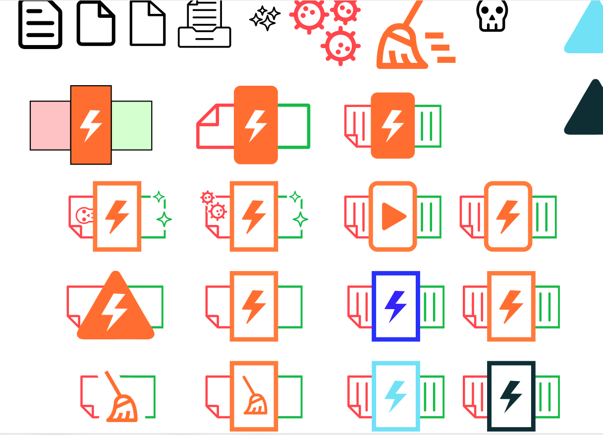
Above:Early identity work
What were the user needs
User needs for Dangerzone can be summarised to urgency and simplicity, depending on the circumstances a user is using DZ within.
If a user has a time limit, for whatever reason, be it crisis response, urgency to publish, safety or needing a ‘clean’ document to pass onto another quickly then the core use case is getting a user to the content in a safe way as quickly as possible. This means reducing superfluous actions, choices, settings and prioritising the speed and accuracy of processing a document/s.
For a user that has time but perhaps is more cautious, processing documents across multiple languages and the challenges OCR’s capabilities as well as processing bulk documents then speed is not the issue but careful management of time and choices/settings is. Helping a user process as many similar language documents as possible, helping them accurately organise across secure drives and folders and ensuring again, accuracy of the final output is critical.

Above:Early identity work
Results and outputs
There were two interaction pathways where the critical initial user interaction method that was explored, split and the UI/UX was developed.
View mode and process mode, became to two ‘persona needs’.
Initially the software took users down single route: open Software -> add a document (or documents but this was unclear) -> select settings for document/s -> process document -> open ‘safe’ document in your default document viewer.
After much discussion about the critical parts that users struggled with, not knowing they could select multiple documents of the same language, not knowing exactly what the complex settings did exactly and critically, not being certain where a new ‘clean’ document was in relation to the old ‘unsafe’ document (some settings moved and renamed files and/or folders). We decided to serve our two user persona types with two ‘modes’, Bulk document processing and view documents as they process.
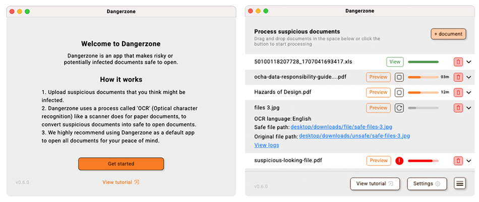
Above:Bulk processing mode
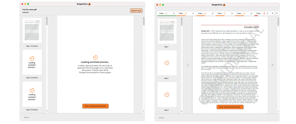
Above:View as they process mode
In both circumstances you could switch between the two views to see the other view. But the View mode allowed a ‘preview’ of the document/s currently being processed so that users could do certain error recovery (like if they had select English language and the document turned out to be primarily in another language - remember the users cannot open the document to check the language given these are ‘unsafe’ documents with potential malware before DZ processes them). The view mode followed UI/UX patterns that common .file viewers follow such as tabs for each document being processed and mini scrollable previews along with their current OCR processing loading state.
The bulk processing view prioritised a ‘progress’ table with loading bars, pause/stop/refresh, delete document processing and re-ordering the process order, icon feedback and expandable sections for error investigation/recovery. Plenty of UI information was needed to be balanced in a single screen.
Each of these processes begin, on opening, with a clear message onboarding users and clarifying what Dangerzone does and how it works. This then moves into a recommended settings screen (that is skippable or findable at a later date) and then into View mode or process mode.
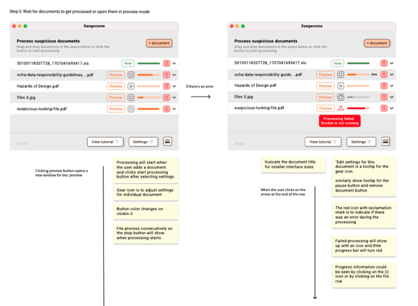
Above:Annotating inside the design file so that the dev team can understand the user choices and rationale
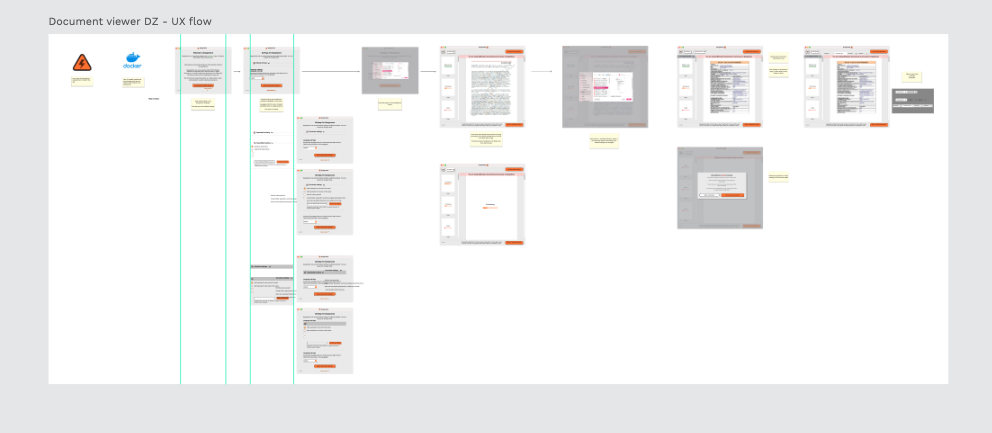
Above:Setting files up for clear linear progress helps when creating clickable prototypes and also for designer handover
When approaching the redesign of the website for Dangerzone we centered around building an identity the appeals to ‘hackers’ and journalists which has high trust significance.
At first I focused on clean and simple visuals relying on the dangerzone ‘bolt’ symbol and also the brand orange, that they wanted to retain.
We quickly moved away from visuals which we too ‘typical tech tool promo site’ as these would not be readily trusted by users looking to avoid ‘big tech surveillance’.
We quickly pivoted to using the limited open stock photography of the kinds of users we’d like to be using Dangerzone - journalists, activists and those looking to share free speech information.
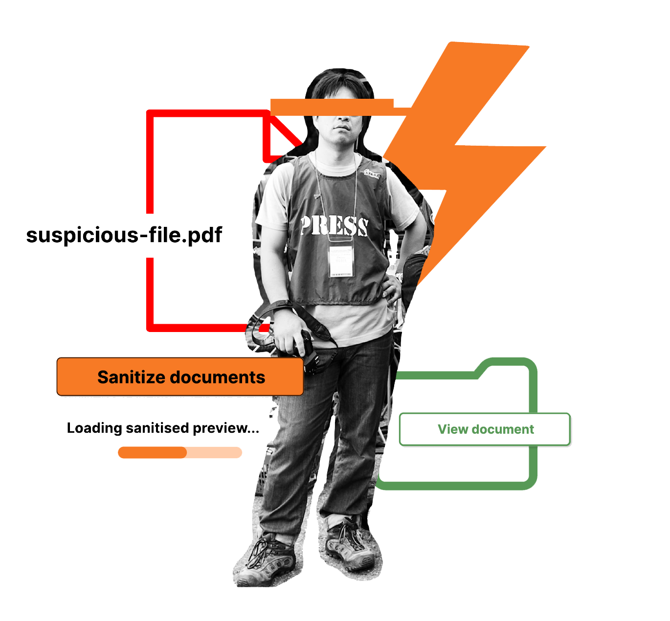
Above:Delivered identity hero imagery
I leaned on DIY, Zine and punk-like aesthetics when working with the photography. Distorting enough that the figure are still recognisable but they retained ‘privacy’ through obscuring their eyes.
I also added in iconography and text from the Dangerzone tool in the hero imagery in order to soft-introduce new users into that language before using the software.
Alongside the final hero images in mock ups in the website I also provided extensive documentation on how to re-create these images,
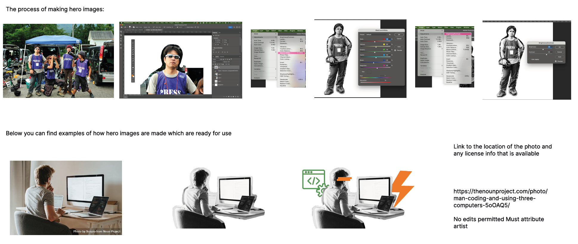
Above:The process of the identity hero imagery
And the team wanted to also explore some fun and light-hearted way to express the risks to users through creating characters out of the common worries associated with ‘infected’ documents. Here you can see a spyware, document -copier and geolocation tracker characters.
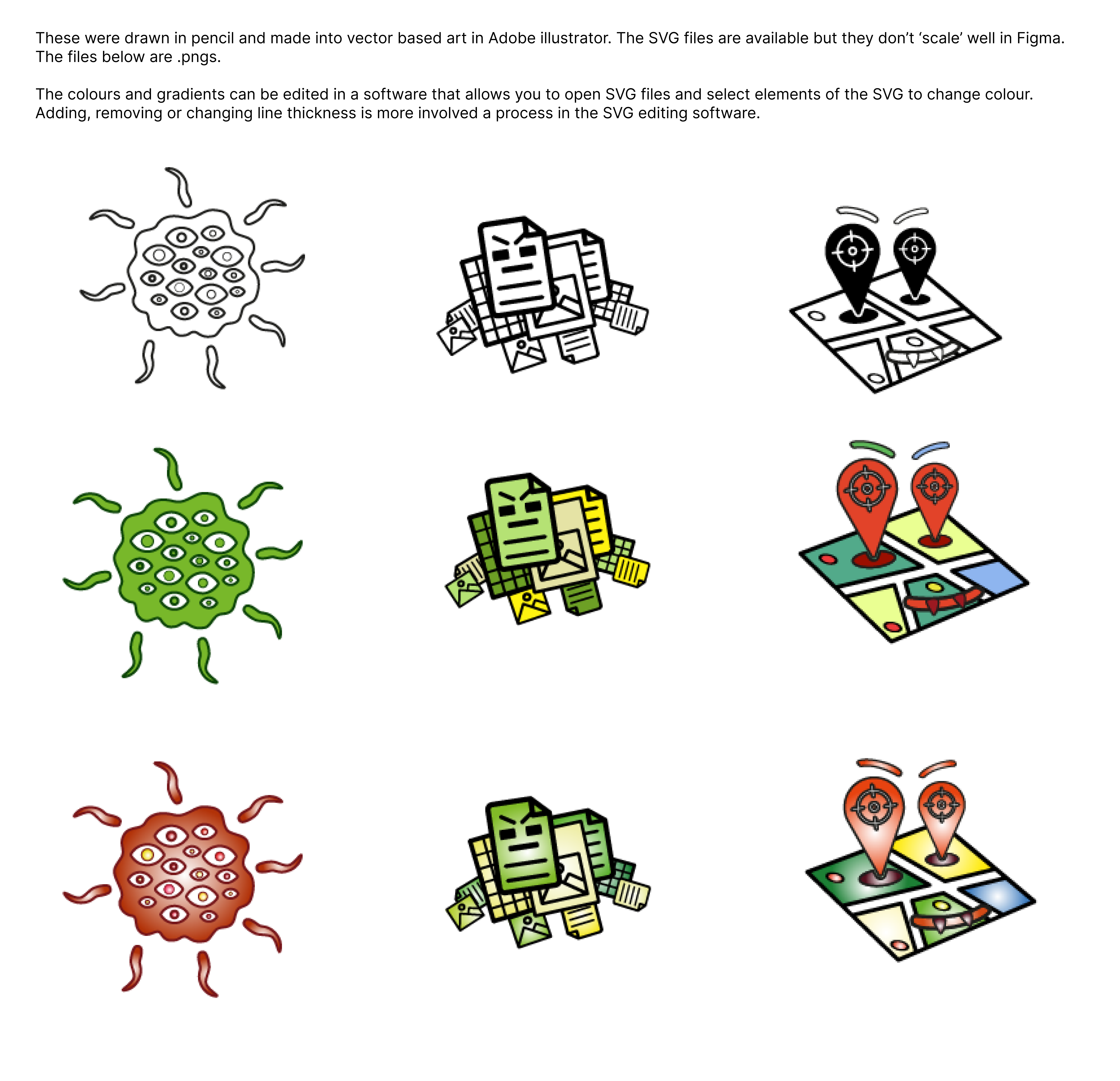
Above:Character development for the various types of malicious software that can infect documents
New skills
A fully component design system built in penpot circa 2023/2024 was a great chance to build out my proficiency in component based design systems.