Mobile Surveillance Monitor
Background and Objectives
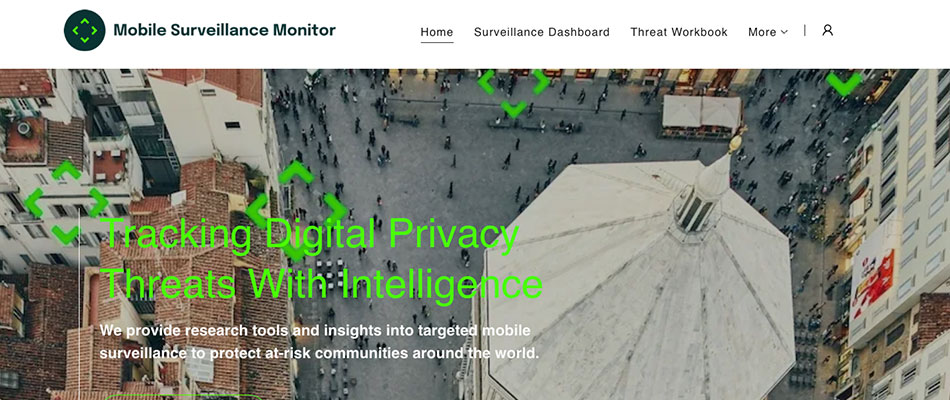
Mobile Surveillance Monitor (MSM) was a newly established and funded project back in 2021. They had not yet explored any identity, branding or user positioning work but had the robust and well researched user case of ‘When users need to find out what malware/spyware risks are prevelant in what countries, where do I go to look?’. MSM has the information and data to power a way for users to check locations, times and types of malicious software and processes but needed support in how tobest present this filterable information to a user, who is in a high risk position, to best support and serve their information gathering needs in order for them to stay safe and secure.
MSM needed to explore not only brand and indentity, but complex user interface data filtering across multiple devices, connection speeds and use cases. They also wanted to explore how best to supplement a user with information about often complex security, privacy and technical issues without overwhelming a user or causes undue panic or concern. Malware and spyware are complex topics that sometimes feel overwhelmingly technical in their nature. MSM was open to exploring a way in which their platform and website can help educate and inform individual users of their risk profile without going into deep detail about the technical side.
Impact
The impact we had in this end to end design project was immense. The founder of MSM had idea on the technology platform that would power the map and GIS based information on the website/product but left teh UX, UI and design to us as the experts. We were able to perform exploratory user research to identify human-driven needs and expectations as well as usabilitya nd user testing of prototypes of the filter and search process of the core tool.
We found that users wanted to have summaries of their filters and searches based on their risks andneeds when looking into malware and spyware risks for their professions and activism. This lead to a robust early information section of the website which helped users to better understand the data they were being served. The next level impact were prototyped as a more customisable ‘dashboard’ of data plus information that can be written or generated based on their own risk profile.
Outputs
- Explorartory user research.
- Usabilitya nd user testing of prototypes and first live product.
- Brand and indentity co-ordinations and development.
- UI, UX and product design.
- Website design, content design and marketing support for essential information.
New skills
The new skills developed here were better understanding the particular users needs. Interviewinga nd speaking with high security risk users has helped me better understand these precarious users needs and how and when they engage with certain tools.


