Interpals.net
This Interpals redesign was a project for an HCI course module.
The project encompassed analysis of the current site, UI elements and brand, isolating the key area of improvement for increasing user understanding and interaction.
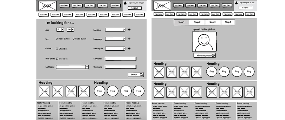
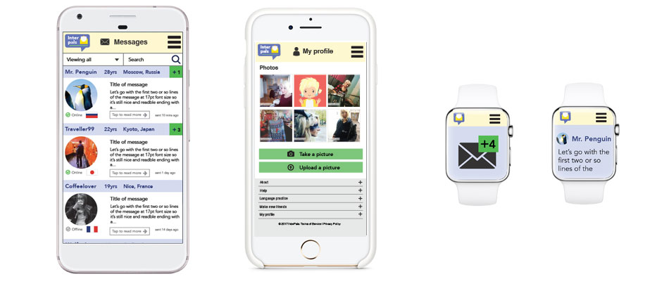
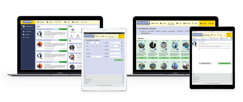
Lo-fi wire-frames were produced and then progressed on to high-fidelity, mocked-up visuals for screens as small as the Apple watch to as large as a digital wall.
My main aims were:
- To reduce the duplications in the navigation and make the key actions easier to find and use (login/logout, messages, friends and search)
- To produce responsive screen-designs that are designed for mobile and smaller specifically as they currently do not exist.
- To make the search process more conversational and less like a set of form criteria, due to the human connection nature of the product.
- To make the message system more robust and fluid for users. Checking, replying and deleting messages needed to be clearer and easier to achieve.
Interpals is a complex product with a rich variety of content, due to this being a personal project and not client based, I would have liked the opportunity to discover with the client what could be consolidated or removed in the product as well as confirming my decisions on the most used features and aiming to improve those.
The software used in this project includes: Adobe Illustrator, Adobe Xd and Balsamiq.
 Wireframes
 High Fidelity screens
 Other screen sizes