How developers understand package security information: UI for Attestations
Project Overview: Making sense of the complex world of open source package supply chain security with attestations, provenance and SBOMs
In December 2024 the OpenSSF’s Technical Advisory Council wrote of the need for a UI and UX professional to understand and address how developers, software repositories and package registries present information and assertions around the package supply chain security information ‘Attestations’. We worked with the Securing Software Repositories Working Group as our key Stakeholder alongside the staff members in the OpenSSF assigned to this work.
Attestations are a fairly new way of understanding a software packages supply chain security. Alongside Provenance information and Software Bill of Materials (SBOMs), Attestations are used to re-enforce legitimacy and indicate a ‘safe’ software package.
The entire project can be found in this website
The Github repo is also available
“A software attestation is a trust mechanism that allows a verifier (i.e., a customer) to independently validate the integrity of something asserted by the provider (i.e., the vendor). For example, an attestation can be used to programmatically verify an application is built in a secure manner using uncompromised code. In other words, attestations make it easier for users of third party code to trust that code.”
Definition via https://danacrane.medium.com/everything-developers-need-to-know-about-attestations-f5051ff3b007
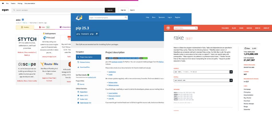
Above: Current visuals of package registry pages package information
Goals and Constraints
This project asked of a 3 person team of designers, user researchers and documentation writers to better understand:
- Who is looking at software package supply chain security and what is the nature of their work/interest.
- Why package supply chain security is important to them (if at all) and what are the risks if they do not assess security well.
- What information to they find, understand and use to inform their assessment of the security of packages in their supply chain.
- What actions do different consumers of attestations make to assure themsevles of the security of their package supply chain (if any).
The initial request defined the deliverables here as a ‘style guide’ that can be applied specifcally to 3 pilot package registries (npm, RubyGems, PyPi).
The implementation stage would be done by a independant implementation party post design, user research and documentation delivery, therefore we endevoured to make as much of our process, conversation and outputs open source and transparent as well as prioritising clear information, drawn from user research as to why certain design choices were made.
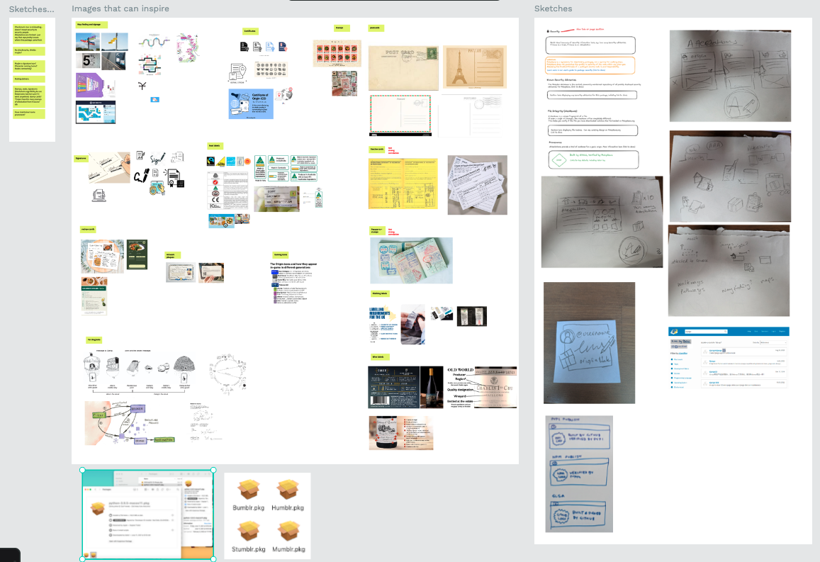
Above: Early mood boarding with stakeholders revealed similar information comprehension patterns such as food nutrition labels
User goals
We isolated 3 different personas for 1 round of initial user research and a subsequent round of usability testing for prototype solutions.
- Users needed to know the critical security information before making a risky package choice.
- Users typically did not want to spend long amounts of time parsing complex documentation and would often rather rely on a combination of social proof and the web of trust to make decisions. Attestation information neede to be minimal, clear, have pathways to more information that progressively enhanced in complexity as the user chose to follow information.
- Not all users have the highest threat models for package supply chain security. Those that did typically worked in finance software, software deployed on hard to reach hardware (e.g. space tech, deep ocean tech) and people that worked with privacy/security tools and high amounts of PII data on users.
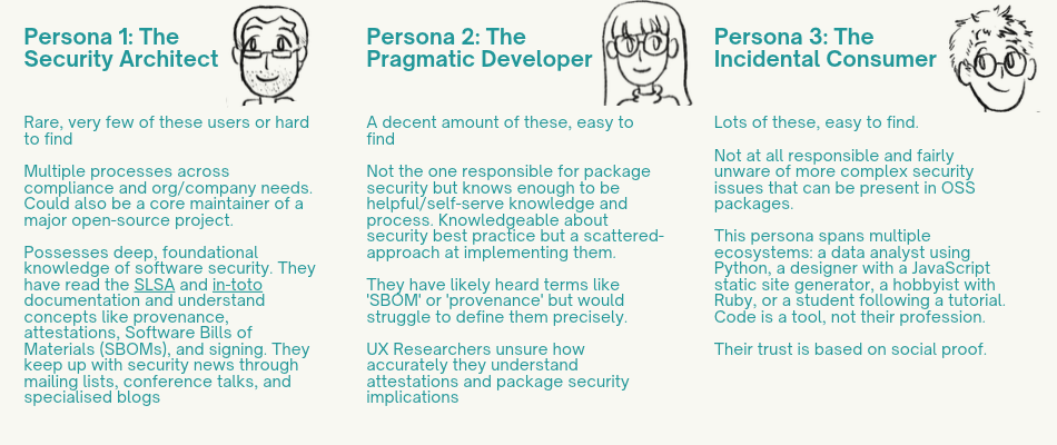
Above: Personas profiles
Organisation goals
The style guide’s intention was to be universally applicable as to be useful across any website or ecosystem’s branding style and prioritise the understanding of attestations within the wider context of package supply chain security.
These goals extended into what makes for good UX layout, positioning of critical information, unique symbols for key information and what additional information/documentation is needed, by what personas at what points in their process.
Methods and Process
This was a 12 week project where timelines were tight and turn-around from user research to UI treatments and rationale was critical. As the main designer working on this project (with support from a documentation writer and technical support) I was responsible for the project from start to final delivery.
The rough outline of the project was:
- Stakeholder engagement and desk research
- Concept understanding and preparation of user research protocols, documents and recruitment
- Conducting user research, synthesising research
- Developing testable prototypes
- Usability testing of prototypes
- Final UI style guide edits, complilation of style guide and documentation writing
It is worth noting that due to the nature of this work the recruitment and conducting of user research was planned and conducted with the highest security protocols possible.
All the tools we used preferenced open source tools where possible.
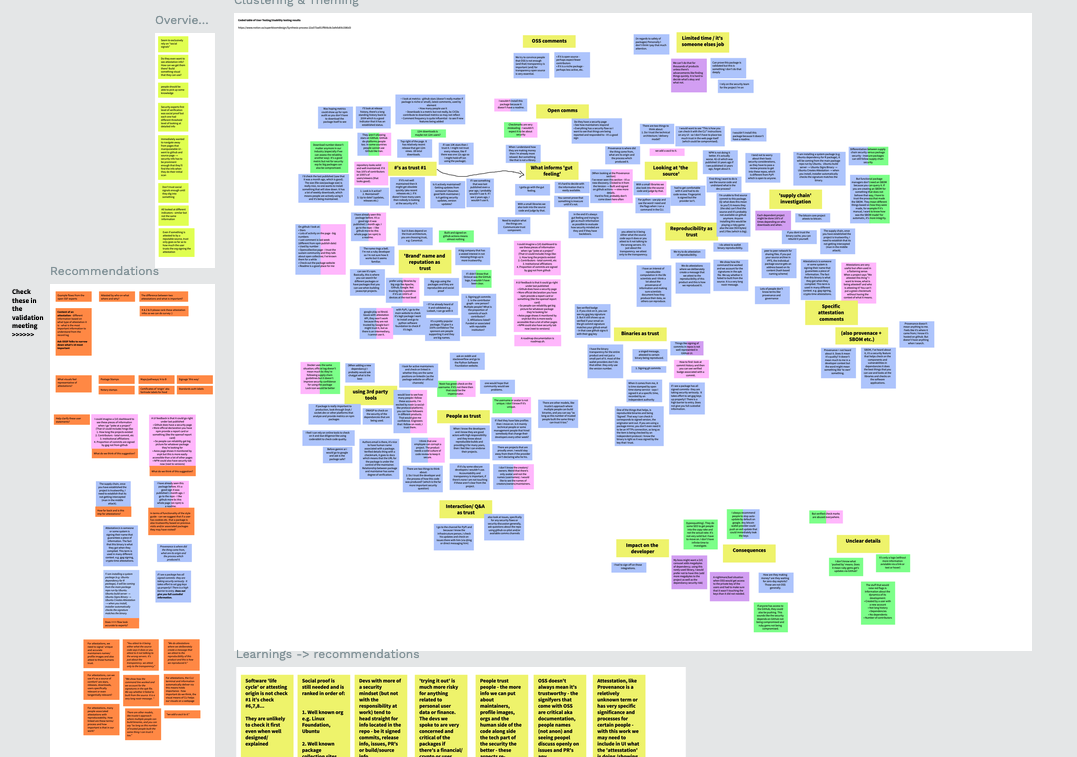
Above: Synthesis on virtual stickies from the user research process
Impact and Outcomes
The outcomes and impact were not only to the client but to the wider OSS ecosystem. In the broadest sense, we brought critical user behaviour insight to the people working on the security of open source software. These insights still impact and inform the conversations about what is shown to users regarding package security.
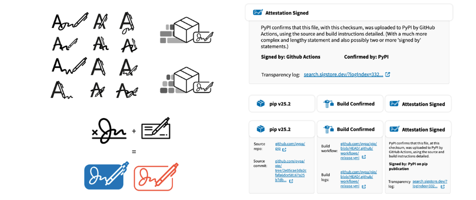
Above: Development of uniue symbols for attestations in relation to packages
On a more granular level there were several discoveries. One of the most prominent was that the words you choose for information content is vital in a security context and can be easily assumed or misunderstood. The word choice ‘build confirmed’ and any use of ‘verified’ suggested to users that everythings fine - and many users in usertesting stopped reading the details and trusted the words.
Confirmed and Verified are not 100% accurate in attestations because ‘an authority’ makes a claim of safety, but it cannot take liability if it ends up not being true.
We also learned and passed on information:
- All personas factor in social proof (who is the maintainer listed, are they well known, is the registry sitereputable) as a key trust factor for a packages safety and source.
- Only the Seurity Architect and some Pragmatic Developers investigate attestations further such as setting up a sandbox test environment etc.
- People working on more risky systems or hard to reach systems have more incentive to find out if a package is safe and to be trusted a.g. banking/finance/crypto wallets or hardware systems in human-hostile locations e.g. space, deserts, underwater etc.
- All personas are fine with critical information being repeated when it’s important as the rationale is there are less chances to ‘miss’ important details.
- All processes for checking build, key signing, hashes etc. took similar steps but in different orders.
- People trust that there will be accurate and human understandable documentation somewhere.
- Quick visual references in sidebars like badges, symbols, icons etc. combined with dedicated security pages were prefered. Not every visit is a high security scrutiny visit.
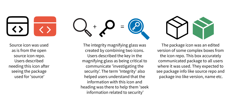
Above: Visuals of the icons and the explainations of what users understand of them when used
This project didn’t particularly invent new revolutionary design processes or UI ideas. But instead moved design practices into an aspect of FLOSS that is routinely overlooked and under-resourced from a usability and design perspective.
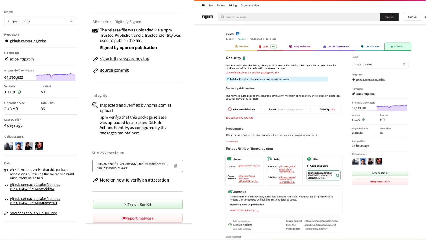
Above: Final UI style guide treatments
We also took an extra effort to communicate that this work did not contain translation and localistion efforts.
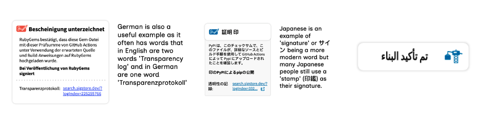
Above: Some examples of the differences in UI when translated/localised
Watch a presentation of this work from FOSDEM 2026
Watch the embedded video over on the FOSDEM Website